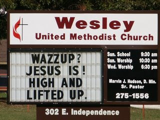
A public service announcement

Ok, so you know me. I've posted this before but it still ranks high on my list of annoyances--Signs. If you can't communicate WELL with them, DON'T DO IT! On the way home tonight, we drove past the vet's office mentioned in this post and it had something written like "We do it because you won't". Or something like that. I don't even remember. All I remember is that it didn't make sense. Here's the orginal blog about my rant. It's worth standing on my soap box again. :o) lol
I SAW THE SIGN
It usually takes a lot to get on my nerves. Near the top of the list of annoyances is really bad marketing. It's probably because that was the field I worked in for so long. There is a vet clinic down the road from me that always has weird things posted on its sign that are incomplete sentences.
"Cheeseburgers and fries..."
Are what? Bad for dogs and cats to eat? Wonderful for humans to eat? Are you advertising for the McDonald's that is across the street? Oh, you are offering cheeseburger and fries at your clinic. Huh? Eewww... I always check the other side of the sign to see if I can get the rest of the message but I'm always let down...and confused. The ONLY time this sign ever made sense to me was when it said something this week like "Check for frozen pet bowls". Good tip, especially if your animals stay outside. I've been reading this sign every day for 5 years now. This may be a good clinic. I don't know. I've never been there. But I do know that I've already marked them up in my head as idiots.
Included in my marketing annoyances is really bad church signs. You've all seen them. They go a little something like this:
"Get right or get left"
"Prevent truth decay. Read your Bible daily."
"We have a "prophet" sharing plan."
“CH CH. What’s missing? UR!”
“Want to avoid burning? Try Son block!”
"Be an organ donor...give your heart to Jesus"
I love browsing on a site called Church Marketing Sucks. It's a really great site for relevant marketing skills and ideas. I came across an article about bad church marketing. It made reference to Crummy Church Signs. The commentary on these signs are too good to not pass on.
"Please, for the love of all things decent, don't use your church sign to broadcast lame quips." - Church Marketing Sucks
The last thing we need is people thinking we are idiots.
Links are here:
Crummy Theology
Wherein we are presented with a series of church signs that seem to indicate that the pastor of said church received his theology degree from the back of a cereal box.
Crummy Plays on Words
Wherein synonyms, antonyms, homonyms, homophones, alliteration, assonance, onomatopoeia, and rhymes are all abused almost beyond the point of recognition. Then, they are placed on a church sign.
Crummy Attempts To Be Cute
Wherein we are presented with a series of sayings that are best suited for an embroidered pillow, or perhaps an ornamental wall hanging. But not a church sign.
Crummy Attempts To Sound Wise
Wherein we are presented with a series of sayings that sound better coming from a fortune cookie, or perhaps a Magic 8-ball. But not a church sign.
Crummy Pop Culture References
Wherein a church, in a desperate ploy to appear hip and culturally relevant, appears to glean more inspiration from reality television and fast food commercials than from the Holy Spirit or the Word of God. And then they inexplicably place that inspiration on their church sign.
Crummy Grammar
Wherein we are presented with a series of sayings whose spelling, punctuation, or ignorance of the rules of basic grammar lead the reader to believe that they were composed in secret by first graders and not in plain view of the general public by the leaders of a church, as happens to be the case.
WHAT?!?
Wherein we are presented with a series of church signs that make us think to ourselves, “What the heck were these people thinking when they put this on their sign for the whole world to see? I mean, were they drunk or something?”
Hell Isn’t Funny
Wherein churches, in a misguided attempt to have humor on their church signs, make jokes about hell, damnation, burning, and eternal separation from God. And then they put those lame jokes on their church signs.
And the best...
Hall of Shame
Wherein the worst of the worst of the worst of the church signs from all categories are collected. Abandon hope, all ye who enter here…..


0 Comments:
Post a Comment
<< Home